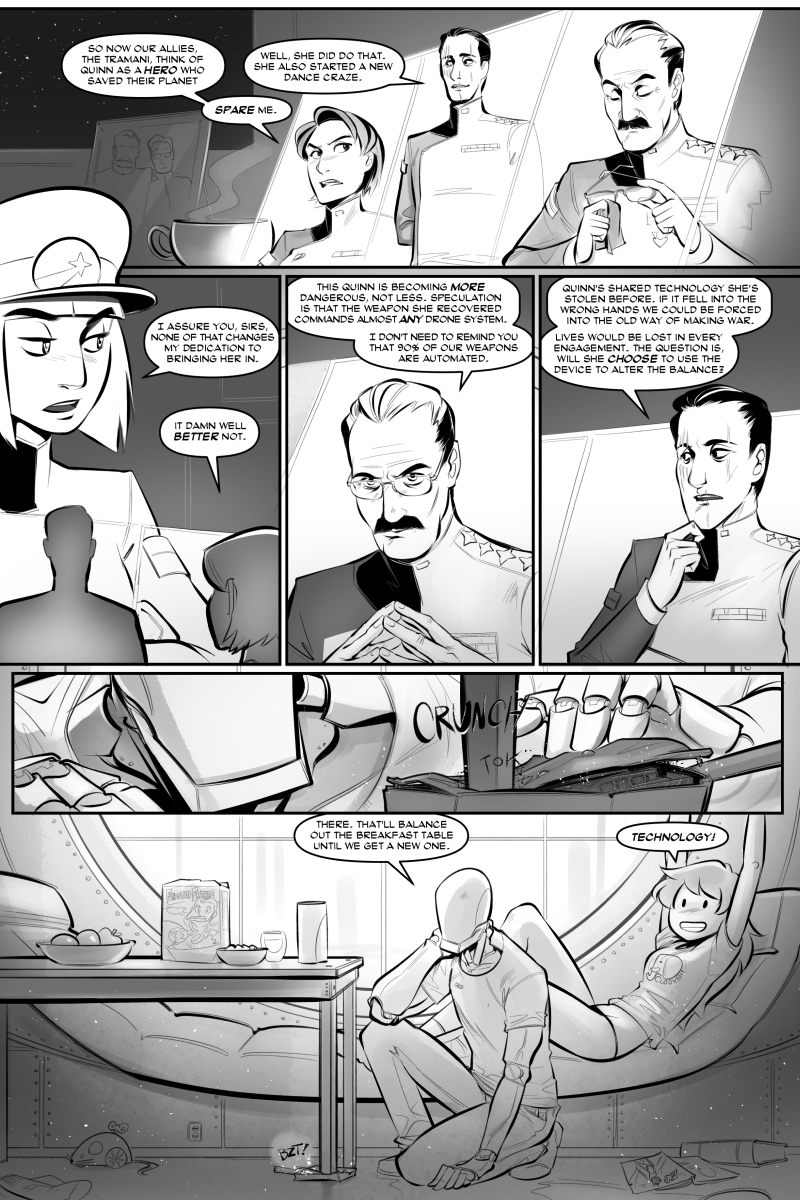
You'll notice there are also books that they could have easily propped that table up with. But, y'know, they might wanna read those sometime while waiting for their cereal to get just the right amount of milky, like Linus! Please also excuse me for trying to slip in the tiny, hard-to-read gag that there's a cereal called Frosted Frakes in the last panel. I believe its slogan is "Bring out the Riker in you!" Haaa. Look, it's funny if you watched commercials during Saturday morning cartoons in the early 1990s... and are also a complete dweeb.
Word has it the new ads Psu has worked on will be cropping up in a few places soon. I'm excited about that. (On the other hand it should bring in new readers who will then be put off by this somewhat atypical page and me rambling about how I've parodied long-disused cereal slogans.)
The book I'm reading/recommending right now is Words for Pictures by Brian Michael Bendis, whose Ultimate Spider-Man comics are why I ever tried to come up with comic scripts of my own in the first place. So far I've seen some nice advice in there about how to work with your artists, much of it information I luckily learned in the forgiving environment of collaborating with Psu. If you'd like to learn that stuff without arguing in emails with your friend about what shape a door needs to be... for days... you might wanna check it out.
- Gunwild
If all goes well, you guys shouldn't really notice anything out of the ordinary. But for disclosure's sake, I've stopped drawing at 600 DPI and drawing now at 300 DPI. The page document is set to 7 inches wide, and ten and a half inches tall, exporting to 800 inches wide for the comic website. This should be more than good enough for reading online. But it might mean any future high res copies or high res prints won't be at the excessively high 600 DPI.
Until 4k monitors get to be super common, or high resolution tablets are in every home, I figure our uploads are still good enough for webcomic work. And with the extra overhead still afforded at 300 DPI, I think we'll be fine for the forseeable future. Unless like... 3d visors become all the rage next year.
Anyway, the move from 600 to 300 came from a bunch of advice on what other people are working in. I didn't expect there to be THAT significant of a difference in my workflow but now brushes feel more natural and my speed has increased quite a bit. It's nice!
And again, if all goes well, you shouldn't notice a thing!
- Psu


